C/O—Beginning of the Year—2017
New Books
Making a book is a herculean task. Countless hours are devoted to a single book—by designers, writers, curators, editors, artists, typographers, production artists, color separators, photographers, printers, paper makers, ink mixers—hours that often outnumber those spent relishing in the final product. How often do we finish a project, hit the send button, push our chairs away from our desks, and then roll right back in for the next thing—all in the same day?
Today I’m going to practice reflection. It’s been such an intense year of exciting, and frankly, life-changing projects. I hope you will enjoy some of these photos and anecdotes, and celebrate these four awesome new publications with me.
—Kimberly Varella and Content Object
Beauty—
Cooper Hewitt Design Triennial
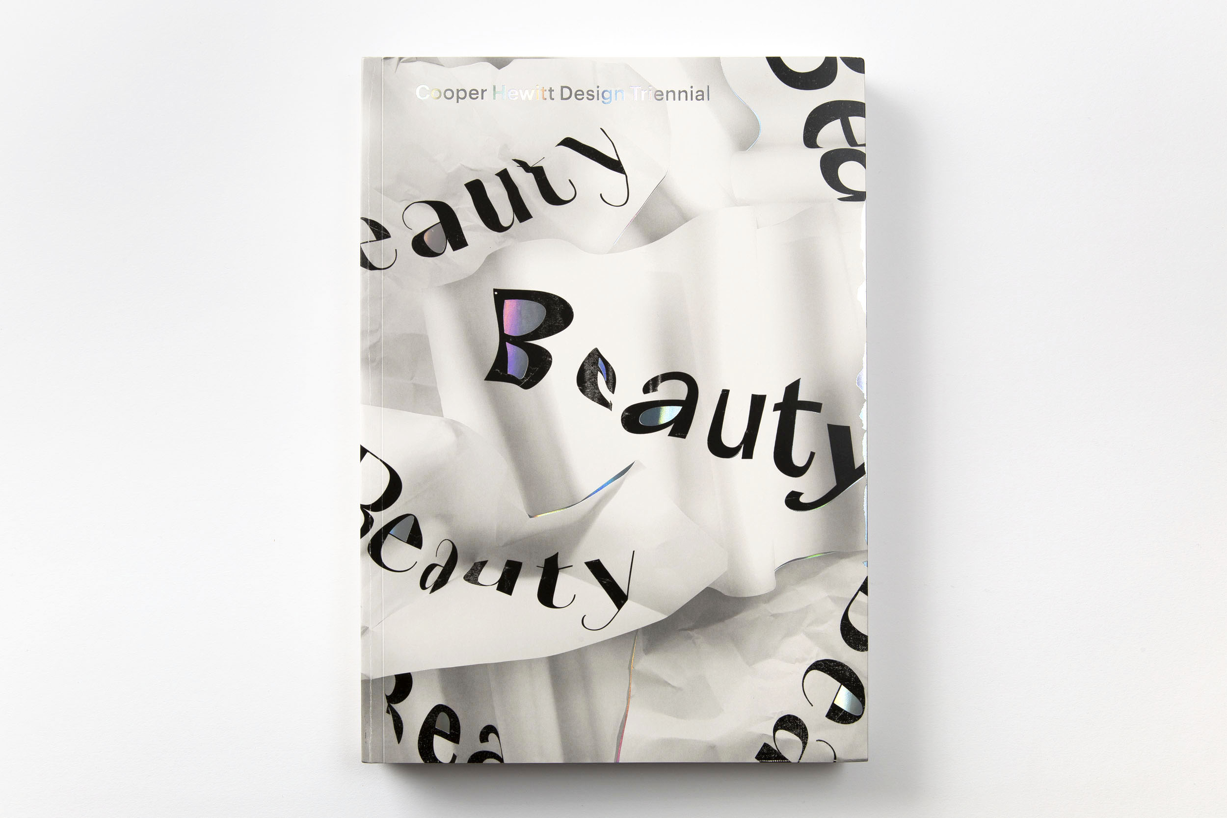

The resultant book is filled with unexpected details: the front- and back-matter are replaced by a ‘heart section’ at the center of the book, fluorescent and metallic inks creep out of the spine in each section, a foiled duplex cover with matching foil stamp warp and reflect, and pink thread holds it all together.
Awards and Recognition:
Print Magazine Regional Design Annual
50 Books | 50 Covers
Cooper Hewitt Design Quarterly
The New York Times
Architectural Digest
Beauty—Cooper Hewitt Design Triennial is a survery of 63 international designers. Edited with introduction by Andrea Lipps and Ellen Lupton. Foreword by Caroline Baumann. Interviews by Andrea Lipps, Ellen Lupton, Suvi Saloniemi and more. Organized by Pamela Horn, head of Cross-Platform Publishing at the Cooper Hewitt, Smithsonian Design Museum.
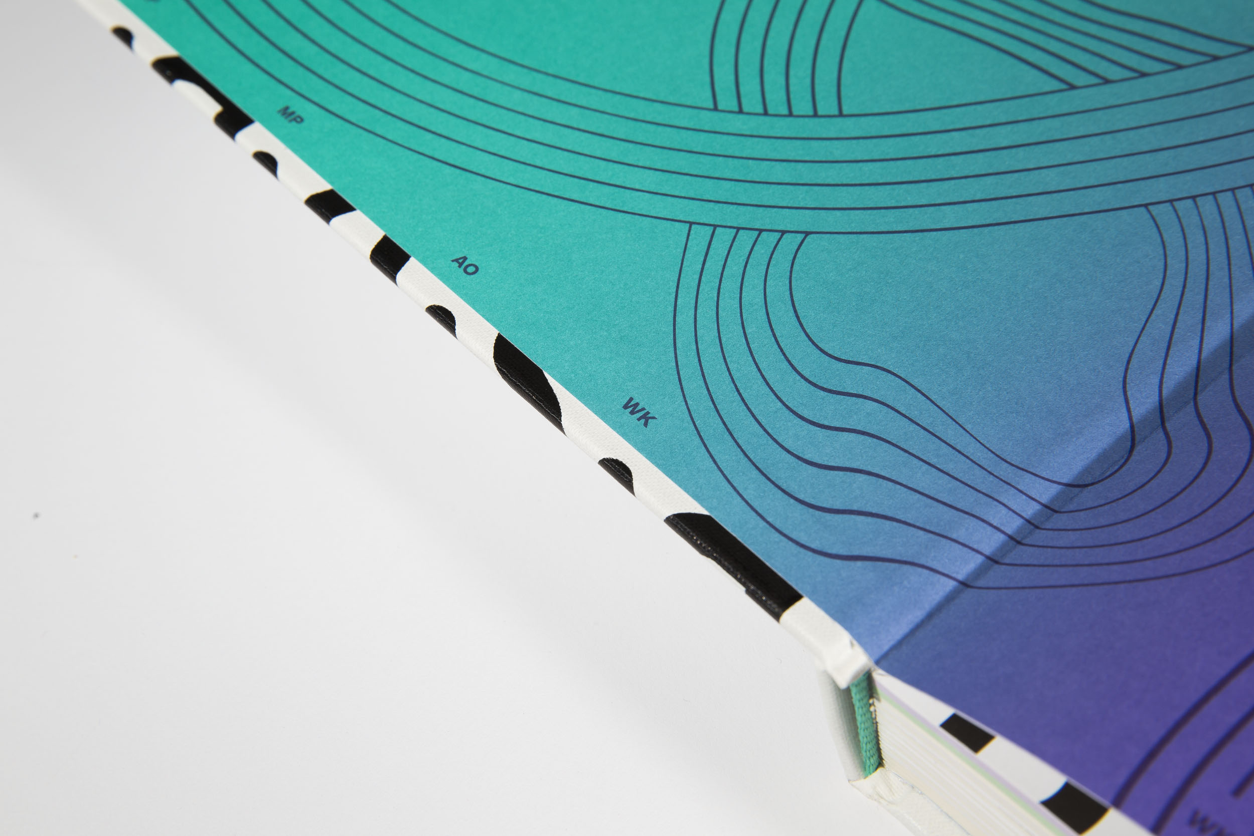
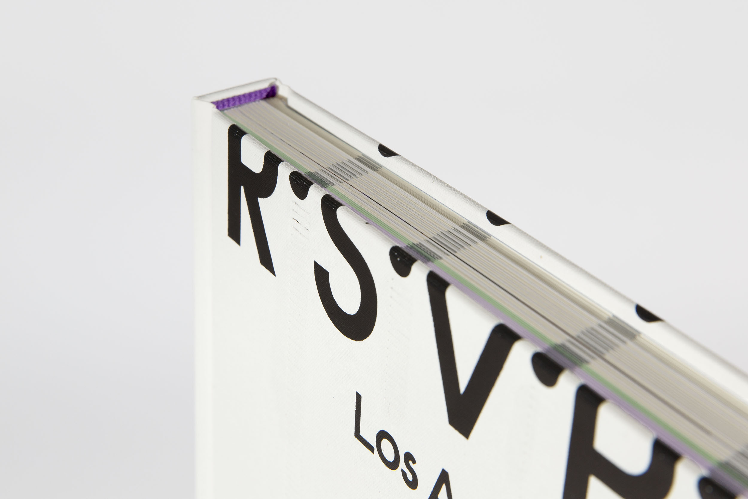
R.S.V.P. Los Angeles—
A Project Series invitational
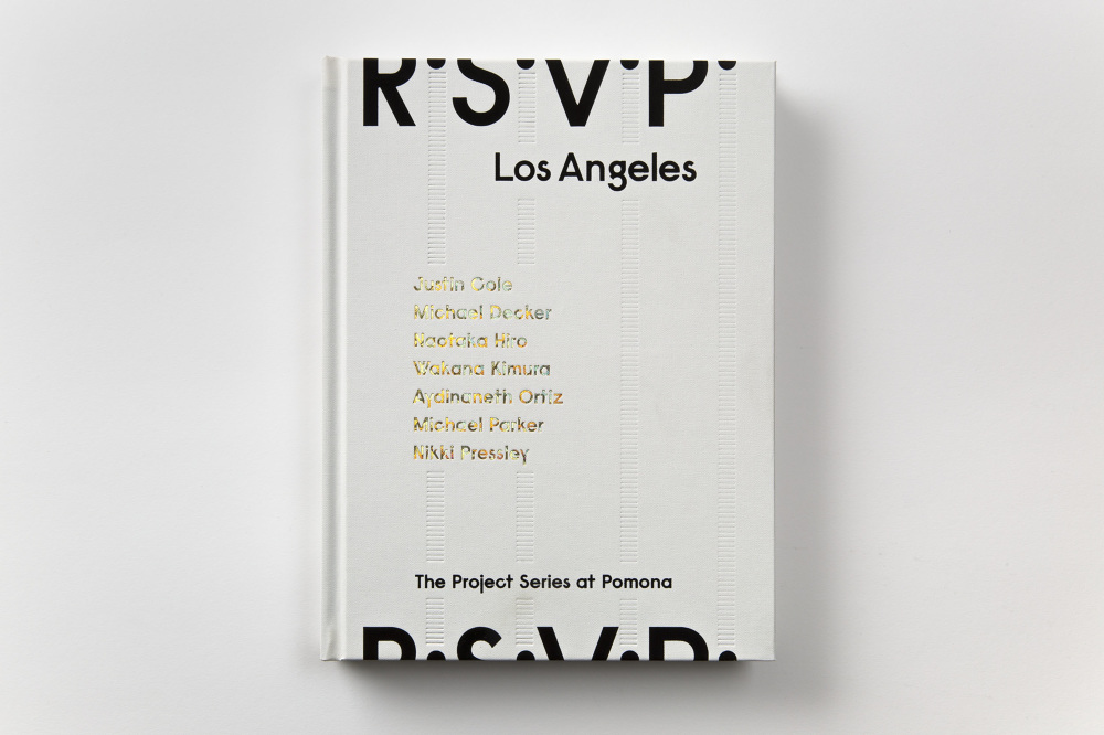
The Challenge: Create a book that 1) Commemorates the fifty Project Series that Rebecca McGrew has curated since 1999, and 2) Serves as the catalogue for “R.S.V.P.,” the invitational exhibition that celebrated this milestone.
The goal of the Project Series at Pomona is to support and cultivate experimental art, a philosophy that carries over into its publications, and one of the many reasons why Rebecca McGrew and I have had such a fruitful collaboration over the years. This is the 11th book we’ve made together.
Notches on the top and bottom of each page serve as a running artist index. When the book is closed, these notches align with the cover, such that the title “R.S.V.P.” appears to wrap continuously around the book.
R.S.V.P. Los Angeles: The Project Series At Pomona is edited by Rebecca McGrew and Terri Geis. Texts by Lisa Anne Auerbach, Terri Geis, Doug Harvey, Kathleen Howe, Rebecca McGrew, Glenn Phillips, Valorie Thomas, Nicolás Orozco-Valdivica, and Sarah Wang. Chronology compiled by Ian Byers-Gamber and Rebecca McGrew.
Ha Chonghyun
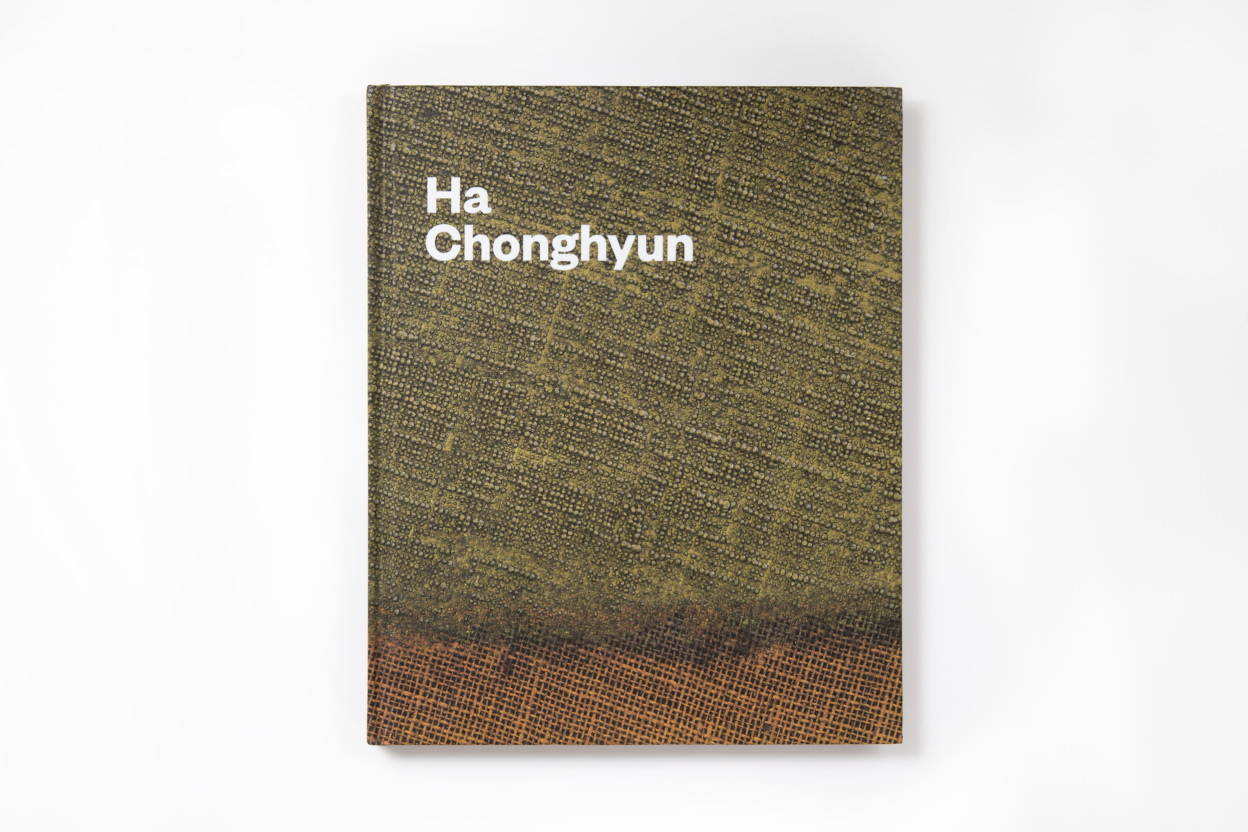

The Challenge: How to deal with reproduction in books? How to accurately represent the work and the feeling of seeing it in person?
To make his paintings, Ha pushes the paint through the back of the canvas, creating surfaces bordering on the sculptural. It proved especially important to feature detail shots, as they better captured the painting’s rich textures. The plates alternate between pulled back shots and extreme close ups, mimicking the experience of moving through the works in a gallery.
Ha Chonghyun is edited by Karen Jacobson with an essay by Joan Kee. Organized by Lynda Bunting, Emeritus Director of Publications and Communications. Designed with Becca Lofchie.
A Strange and Fearful Interest:
Death, Mourning, and Memory in the
American Civil War
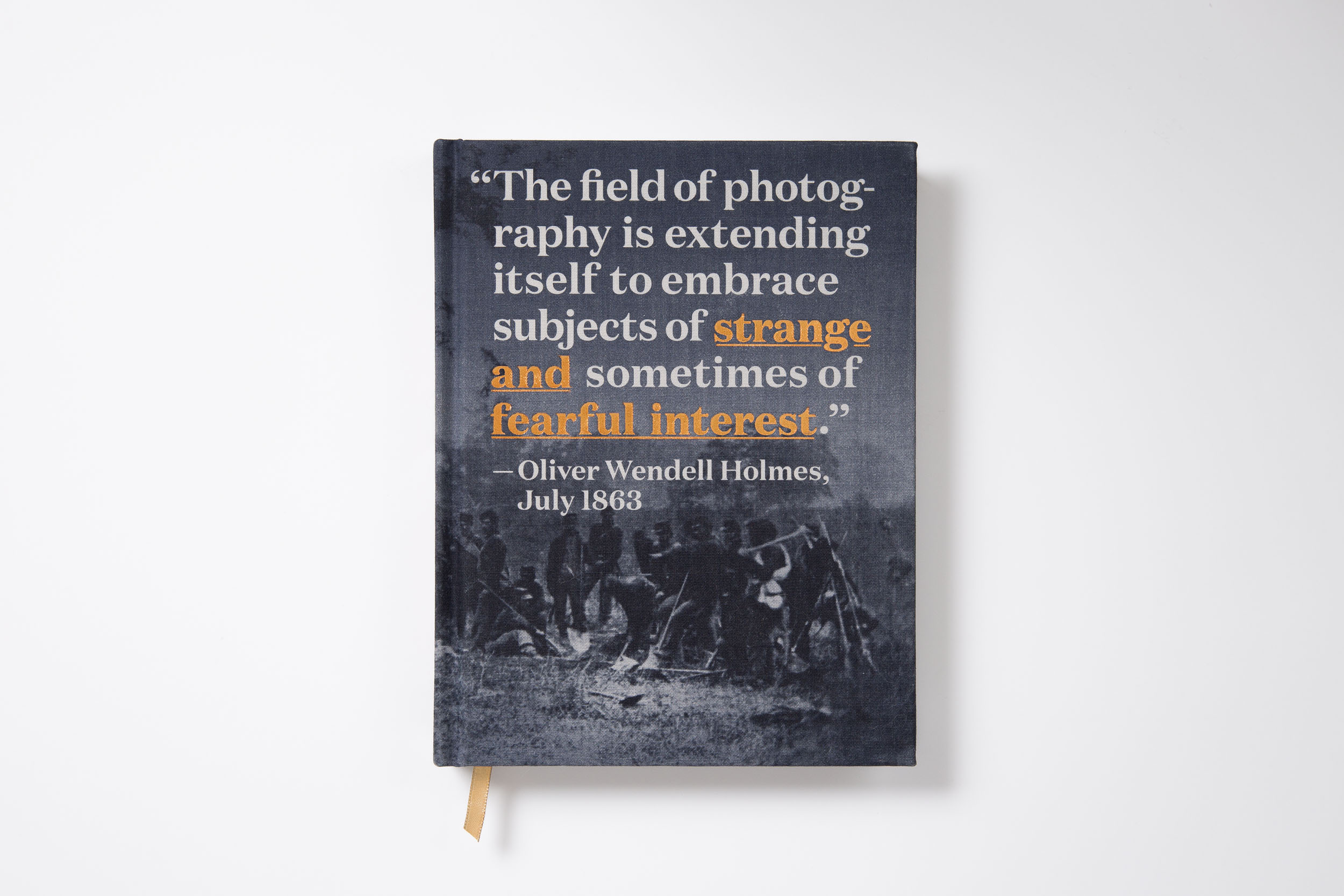


The Challenge: Capture the somber and unique materiality of 150+ year old photographs from the American Civil War and its relationship to media technology.
At the project’s outset, curator Jenny Watts took me into the Huntington Library’s vaults to view some of the photographs from the exhibition. This initial interaction carried directly into the book’s design. The final size, 6.5 x 8.5 inches, is small and intimate, yet big enough to show most of the work at actual size. The book is printed as a semi-process (CMYK) with the standard black ink (K) substituted for PMS Black 6—which contains a small amount of silver. The result is true to the photographs themselves: dark, murky yet crisp, ghostly and rich.
Incidentally, the book featured the typeface “Domaine” by Kris Sowersby (Klim Type Foundry, add link) who was one of the featured designer’s in the Beauty: Cooper Hewitt’s Design Triennial.
Links:
50 Books | 50 Covers
A Strange and Fearful Interest is written and edited by Jennifer A. Watts with contributions by Barret Oliver and Steve Roden.
|
|